Friday 4 April 2014

Evaluation - Question Seven

Looking back at your preliminary task, what do you feel you have learnt in the progression from it to the full product?

Beth has answered this question in the form of a SlideShare presentation, the slide is embedded below. She has compared the features of our preliminary task with our final video.


Thursday 3 April 2014

Evaluation - Question six

Simran has answered this question using a timeline on TimeToast.

What have you learnt about the technologies from the process of constructing this product?


Wednesday 2 April 2014

Evaluation - Question Five

To answer this question I have used a powerpoint video maker called Kozea to present this information. I used this piece of media as I have never used it before, and so it was a change from other powerpoint presentation programmes I have used in the past, for example, Prezi.


evaluation - Video Maker


I have also created a video using the annotation tool on YouTube to highlight how my group has specifically tried to contact and address our opening titles and sequence. I've embedded the video below. 

Evaluation - Question Four

Who would be the audience for your media product?

Simran has answered this question in the form of GoAnimate animation, the videos are embeded below. She's created a profile of a typical audience member viewing my groups final film project on GoAnimate. Within the animaions the profile entails information on the target audience member's hobbies and interests as well as a little bit of psychographic information.

who would be the target audience of your product? by s_tak on GoAnimate
who would be the target audience of your product 2 by s_tak on GoAnimate

 Our film would appeal to Emma because she an interest in murder mystery/crime shows which can be similar to psychological thrillers and horror films. Also Emma is a teenage girl with a clear liking for horror films and so she would probably look forward to watching my groups film 'The Perpetrator' in cinemas. Furthermore 'The Perpetrator' is similar and in the same genre of some of her favourite films so our film would easily appeal to her. It can be noted that my group's target audience questionnaire results have also made it clear that a girl like Emma is our ideal audience.

Tuesday 1 April 2014

Evaluation - Question Three

Below is a mindmap I have made on Bubbl, displaying what media institutions would distribute my film and why. I used Bubbl as it was a new type of media to me and it is well organised and easy to read.


As explained on the Bubbl, there are various media institutions that would distribute the

Evaluation - Question Two.

How does your media product represent particular social groups?

The opening title sequence of 'The Perpetrator' aims to represent the social group of teenagers. Below is a split screen collage Beth created in Photoshop. She's chosen to compare the main character in our film, Amy, with the main character from Scream 4; Jill. Jill's character is an example of how teenagers are connoted in horror films and so my group has drawn some inspiration from her character.

Both teenage characters are wearing similar black and white costume; wearing a white t-shirt, and informal black bottoms. Also, both girls are wearing similar dark grey boots. Furthermore, they both have similar coloured hair and similar styled. Jill and Amy play victims in their films however, Jill, unlike Amy's character acts like a victim to hide the fact that she is the serial killer. Another key difference is that Jill is wearing slightly more casual loose fitting clothing, whereas Amy has more layers on as she is filming outside in a different climate. Also, the lighting in the two shots is different. It's clear that Amy was filming during the day and Emma Roberts who plays Jill is filming this scene during the night.

All in all, the elements listed above help represent a normal young social group. My groups final film project also aims to represent this social collective. The teenage actor in my final project looks like a normal everyday teenager - wearing casual clothing and acting like most teenagers do, doing nothing out of the ordinary or anything out of character for a teenager in today's day and age.


Evaluation - Question One

In what ways does your media product use develop or challenge forms and conventions of real media products?


 Above is a contact sheet that Simran has created on Photoshop featuring stills from our horror film opening sequence.

1. The first frame denotes the location/setting in our film. It is a slow panning shot, acting as an establishing shot. From this shot it becomes clear to viewers that the film is set in an abandoned forest, a conventional setting of the horror film. Shots like this are typical in film openings as they grab viewers attention and help to create a mood for the overall film. In this case the slow paced shot creates and eerie mood.

2. I am introduced as the character in our second shot. Like most conventional film opening the main character in the film are introduced in the opening sequence. A low angle shot introduces me as I walk towards and past the camera into the forest.

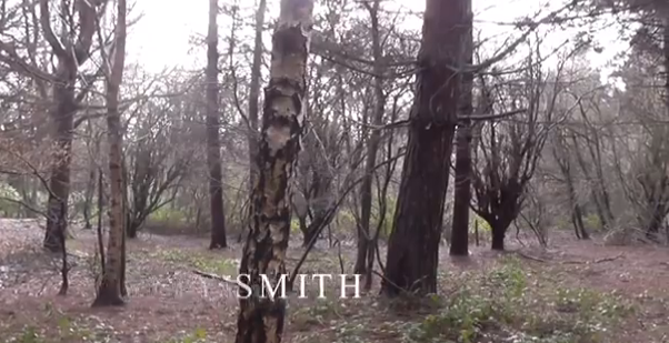
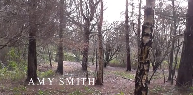
3. The title font is shown in the third frame. It is quite bold and eye catching. My group chose to use a simplistic font as in horror titles the font aren't usually very over styled. We gave our white titles font a glow and shadow making it seem ghostly connoting that our films narrative explores people dying. In horror films its conventional for title fonts to reflect the storyling. For example in 'The Cabin In The Woods' the titles font looks like dripping blood, connoting that the film has a dangerous/violent storyline.

4. The fourth image in the contact sheet highlights how our opening sequence suggests the genre of our film. This is another connventional feature of film openings. We have made it clear that our genre is horror by using an isolated forest, creating a tense mood. Also, the character is young and blind to the dangers around her which is another stereotypical feature of horror films. Furthermore, this camera angle suggests that someone is watching Amy from afar, connoting that she could be in great danger in the next few scenes of the film.

5.Costume and props are denoted in this image. The character is denoted in the frame wearing leggings, a hooded body warmer, a black jumper and a plain white tshirt. Her whole outfit follows the stereotypical representation of teenagers, as she is wearing informal clothing. Also, her hoodie is a piece of iconography associated with teenagers.

6. Camera work and editing is denoted in the next frame. My group have used a match on action editing technique in this part of the film. It's quite conventional for these techniques to be used in all genre films.

7. My group has used special effects in this frame. We put a tinted filter onto this frame, to make it seem like the character is being looked at from another characters perspective. This is also connoted by the framing of this shot as the character is being observed through tree branches, connoting that someone is secretely watching her. We also used a hand held filming effect in this part of the film to make it look like a point of view shot.

8. The story builds up as the opening sequence progresses. The character is last seen on screen looking shocked and frightened, leaving viewers wondering what will happen next. This sets the story of the film up and suggests that someone of great danger is in the character's town. To keep our titles conventional we decided to keep them slow paced and not to have too much action in them, as this would go against typical film titles. Similar to films like 'Scream', the character's story is building up to the main story in the film and we have tried to draw inspiration from Saw where one of the various characters in the film is killed off in the opening.

9. The last image on our contact sheet is of the main title in our opening. We decided to have the main title at the end of our opening sequence as it has a dramatic entrance and leaves a cliff hanger as to how the story will further unfold in the film. It's also conventional for the title to be after the opening sequence in horror films, as seen in the video below from Scream 4. My group chose the title 'The Perpetrator' because it means 'someone who commits a crime or evil'. The title reflects the horror genre. It also relates to the story line in our film where a serial killer is on the loose.

Overall, my groups opening sequence and titles are meant to be conventional of the horror genre.

Thursday 27 March 2014

Final Titles

Below I have embeded the final titles and opening scene that we have created. I was acting in the project, while Beth was in charge of the filming and camera angles and filming and Simran was in charge of directing. All of us came together to edit the clips to make this finished piece of work.

Thursday 20 March 2014

Editing Stage Three

As we come to the end of our editing, little things must be added to create a good overall product, for example the credits had be added, it is key that we use a font that fits with the horror genre, and select a colour that fits in with conventional horror film colour schemes. Below are screen shots of our selection process in deciding what font we will use,


  • The name of the titles that we decided looked the best is 'Feature' we chose this because the font fades in and out, leaving a eerie spooky atmosphere. Here we are placing it onto the footage and positioning it somewhere that looks best. 


  • This screenshot shows the titles fading in, this looks good as the simplistic white font that fades in and out has connotations of ghosts and spirits, which is very much linked with the horror genre. 


  • This screenshot shows the font we titles we have chosen fully, as can be seen it is a simplistic font, that has not too much detail, and the letters are all in capitals, suggesting this is serious film, and the mysterious atmosphere has been set.

Wednesday 19 March 2014

Editing stage two

One of the conventions of horror movies is having appropriate music over the top of the footage to create a tense and suspense atmosphere. The music that we searched for has come from a royalty free website called SoundCrate.


The screenshot below demonstrates the music on top of the footage for our film. The name of it is called 'The Hotel Room' and we saw how well it worked with the footage we have. It turned out to be effective and created the atmosphere we were aiming for. 


During today's lesson and this activity, we learnt what kind of music will work well with our footage and what kind of music will not. This will impact our final music video because we will have music that flows with the timing, pace and atmosphere that we are aiming for in our horror film. 

Tuesday 18 March 2014

Editing Stage One

In today's lesson we uploaded our footage, so we can start editing on Final Cut Pro. We looked at all the footage we had and cut off some of the excess part of the clips in which we didn't need. Below are some screenshots of the editing stages:

Adding in the footage that we need, ensuring it is in chronological order:


Deciding where we need to cut off parts of the clip we do not need:


Cutting off the parts we do not need:


Today's lesson has further improved our editing skills and has been useful to help us decide what parts we need and what we don't. Therefore, we won't have any unnecessary footage and this means our work will run smoothly and editing will work well.


Thursday 13 March 2014

Pre-filming activity.


Canted angle test footage
As a group, to practice our camera shots prior to the filming we did a few 'test shots' to make the filming process easier. One of the shots we wanted to use in our final project was a canted angle from the floor level, so therefore we decided to do a test of that. Our plan is to introduce the main character into our project this way. This is also a convention of opening titles and scenes. The setting of the place we are filming is a forest, and this may create problems when doing the canted angle, hence why we did a run through first. 

Editing
After uploading our footage in Final Cut Pro, we applied filters on top of it to make it darker, as most horror movies are set in dark locations to create an eerie/thrilling atmosphere for the target audience.
A filter we experimented with and applied was 'Isolate'. It made the footage darker which is what we aimed for, and we believe this could be a potential filter for our final film project.        

Before filter:                       


After filter:


'Romantic' was another filter that we used and like in Final Cut. It created a slightly hazy effect to the shot.


This effect could be good to use if it's raining on the day we film and so therefore we can not create the atmosphere that we aimed for naturally, so we would have to use filters to create a similar effect. We also tried out some audio filters such as 'Cathedral' and 'Delay Designer' we chose to use the latter audio effect to enhance the natural sounds of birds and Beth's footsteps, as it will draw focus on her entrance in the footage. This audio filter would be good to use in our final project. 


Edited test footage

Friday 7 March 2014

Health and safety form.

Below I have embeded the Health and Safety Form Beth has made using SlideShare. It is important to clear up and prepare for any risks and dangers that may happen and by doing this form we can make ourselves aware of how to avoid them, so the creation of our project can run as smoothly and simply as possible.


Wednesday 5 March 2014

Research and Planning


Simran has illustrated the storyboard for our titles and opening sequence, as a group we discussed and planned what each scene in the opening sequence would have in it.


I have created a shot list for my group to help plan what shots we are going to use, the location, what exactly is happening in the shot, the people taking part in the shot and the equipment that will be needed during the course of shooting. I did this because it will help keep the day of filming organised and the group knows what is coming next and everyone knows what they will be doing.

Thursday 27 February 2014

Costume.

As I am acting in the final project, this is the costume that I am wearing.

I am wearing black leggings, which is a popular piece of clothing for teenage girls, and the aim is to make me look like a conventional teenager. I am also wearing a hooded bodywarmer, this item of clothing is similar to a hoodie, which is commonly associated with teenagers.

As the outfit is all dark, it connotes danger and mystery. This creates suspense for the audience. It also foreshadows dark events that may happen towards the end of the film.

Monday 24 February 2014

Bentley Priory location shots

These are pictures of the location that my group wish to film in. It is called Bentley Priory. We chose this setting as it is in a forest and is isolated, and this is conventional of horror movies. For example in 'The Cabin in the woods', the main setting is in a forest.


Monday 10 February 2014

Idents created for the final project.

As a group we put together the storyboards of the ident that we wanted to create: 


 We decided it would be more conventional to have two idents in our film opening, because from the examples we looked at, all of them had two. We used the programme Final Cut Pro to make the idents. The first one is very generic, showing that they produce all sorts of films, and the other one is for films that produces only horror films. 

Ident 1. 
This ident is the generic one, that represents a large film company. From the cloud inspiratinon in the DreamWorks ident, we have used clouds in our own ident. This also shows that our ident is well rounded and creates a variety of films.


Ident 2:
This ident represents a small production company that only creates horror films. Therefore, we chose a black and red colour scheme. A red mist of blood was downloaded from a Royalty free website and we used a thrilling soundtrack to create further suspense and tension. This was inspired by other horror production companies like 'Dimension Films' who produced films such as 'Scream'.

Tuesday 4 February 2014

Film Ident Research

In today's lesson I learnt that an ident is what is used by production companies to identify that they are part of the production of a film or TV programme. Sometimes idents allow and insight to the film genre or the storyline and set the mood for the media text about to be shown. An ident is usually about 20 seconds long.


Lionsgate
There are two idents that Liongate have used in the openings of films they produce. Lionsgate is a leading horror film company, and looking at their idents may help me to gain ideas when creating my own horror ident for my final project.


Design
The video above is Lionsgate's most recent film ident and it lasts 22 seconds long. At the start of the ident clogs and gears are denoted and they are the main focus of the shot. The camera pans around the gears denoting the gears all moving together and then the camera zooms our. The camera appears to move further awway from the gears and continues to zoom out. The clogs are then shown moving through a key hole in a door, the camera continues to reverse zoom and then two majestic doors are thrown open, in which the word 'LIONSGATE' shows up.

Intention
The gears and clogs in the ident connote complexity of the films they make. They could aim to be opening up the audience's imaginations with the vision of the doors opening. The ident is very dreamy, which also connotes that they could be opening up the audience's imaginations.

Lionsgate Alternative Ident  m

Design
This is an alternative Lionsgate ident I've found online that is commonly used in Lionsgates horror films. The ident starts off the same as the original Lionsgate ident denoting gears moving on screen with panning and the reverse zoom with the camera moving backwards. However, the colour scheme is this ident differs from the original unlike the original dark red hue colours are used. The clogs are broze and rusty looking instead of looking metallic and clean like the original. The background colours are also much darker in this ident with orange, brown and red hues. The doors in this opening are also very dark and they dont have the prestigious lavish look which is denoted in the original ident. Unlike the original ident the clouds-cape is coloured red and dark brown and the text in the center of the screen is dark grey. At the end of this ident the clouds-cape's dark red colours glow to a bright red with the text remaining in the center of the screen.

Dreamworks
The second set of idents I've chosen to look at are by DreamWorks entertainment, I've chosen to look at this company as I feel that they are well known for creating alternative idents to relate to story lines and themes explored for each film they create. I could draw inspirtation from this and create unique alternative ident which clearly denotes the themes that my final project will include. I'm looking at two of DreamWorks idents because DreamWorks is a company that creates various alternative idents for each of their films in relation to their storylines. For example the Shrek movies have their own alternative idents under DreamWorks. I think an ident should relate to a films narrative and therefore it could be interesting to look at some of DreamWorks idents, as they can inspire and influence how I create my own ident for my final project.


- 28 seconds long.
- Young boy sitting on the moon fishing in the sky.
- 'Dreamsworks' pans on screen.
- Connotes imagination.
-Blue and white colour scheme.


Thursday 16 January 2014

Horror Film Step Outline

To gain further ideas and inspiration for creating the opening credits and scene of a horror film my group has decided to analyse an opening of a horror film.

Below is a word document I have embedded using Slideshare. I have analysed the different frames and shots used in the opening titles of Sweeney Todd. I have broken down the description of the shot, the mise en scene, sound, editing and typography used. This will helpful as we will know the codes and conventions for a typical horror movie opening.


Monday 13 January 2014

Film pitch, padlet and amendments


Film Pitch from simrantakhar

Above is the Film Pitch, detailing our ideas as a group for our opening titles. We have included a synopsis for the narrative, a resource list and a locations list needed in our film, also there is some information on the title of our film and its genre. Simran has created a slideshare, to depict our ideas in an interesting and creative way.

We needed feedback on our ideas, so that we could determine if our ideas were along the right lines, or if they needed any adjustments. Any feedback on our ideas will be useful and important, as comments from our peers will be hugely influential when we create our horror film, as we will know we area meeting our target audiences needs. Below is the embedded pad let, with the What Went Well comments, and some Even Better If... comments.